COLORS X STUDIOS
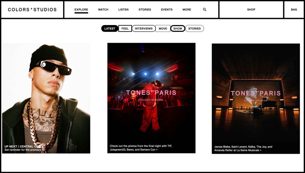
The COLORS x STUDIOS website colour scheme is prodominanty kept to a minimal black and white. This suits their website due to the content that they produce for the website.
Their content is easily recoginsed across platforms due to their use of bold monochromatic colours tailored to each artist. The white background on their website provides a clean background that allows for them to present their content without conflicting colours that don’t work together or feel overwhelming to the viewer. It also keeps the focus on the artist and reinforces the statement made in the artists video of less is more and visual expression.


Accross the website, they use black for text, buttons/navigation, borders and some parts of the background. It continues to align the focus on the content of the website and almost serves as a foundation to the pages.

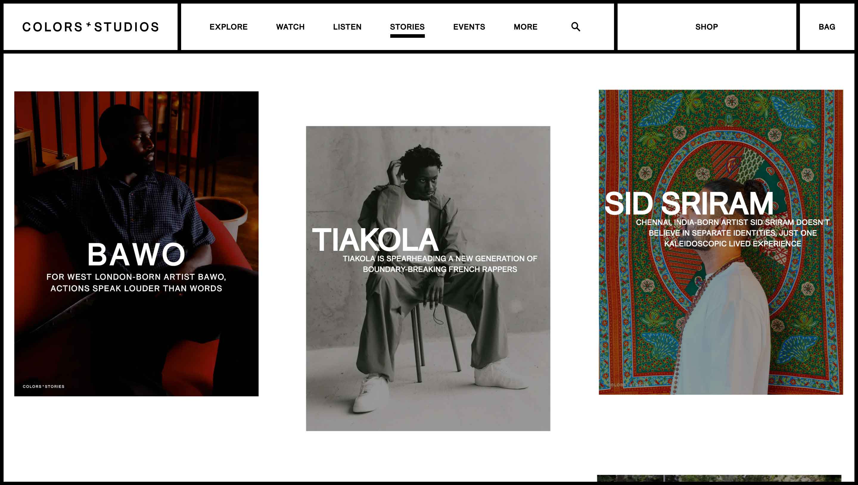
In all of this, black and white are used interchangibly for backgrounds and text.
Cadbury
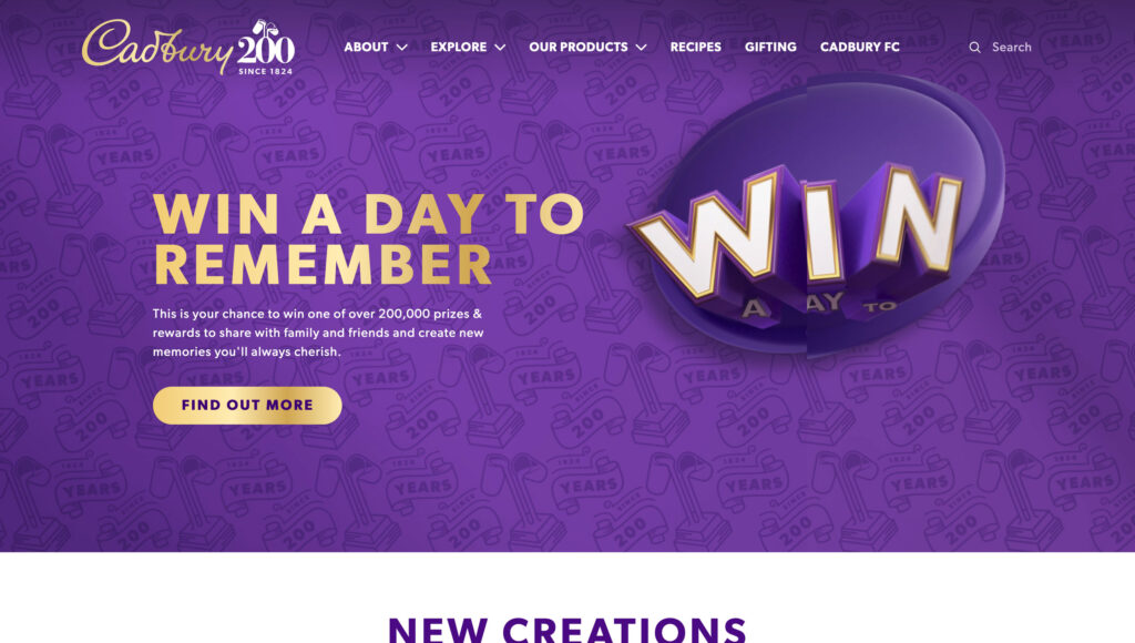
Deep Purple as background colours. Not only is it their main brand colour – which is easily recognisable, but it also aids the idea of indulgence & richness of their chocolate


Golden buttons – coincide with their brand where the gold colour is used for the text on their logo. It also creates a strong contrast vs the purple which makes the buttons pop/stand out.
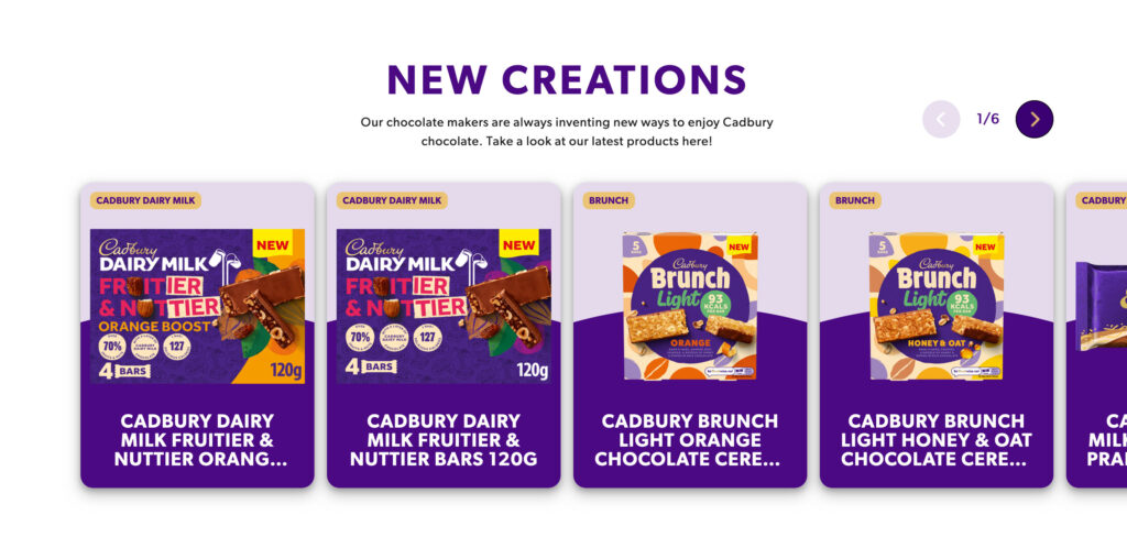
White used for text on the purple background gives good contast and clarity. On the reverse, the white background not only is a breath of fresh air within the intense purple page, but it allows the focus to the products.
Dr Martens

Dr marten have a strong brand image which is reflected in their colour scheme. The core colours are black and yellow which ressembles their original boots which sport their iconic yellow stitching.

The use of colour across the website is bold and is combined with another colour with high contrast. For example, the yellow buttons have bold black text and the black buttons have bold white text – again a reflection of their brand. The use of an off white colour for the background not only helps to keep the focus on visuals but also allows for the yellow call to action buttons to stand out.


Other colours are used sparingly accross the stie but remain a good feautre for the use of colour. While the green, red and blue are used to help provide quick information to the user, they are not as bright and bold as the yellow. The contrast to the white/grey backgroud still make the use of these colour effective.
Dr martens have a strong brand image and it is well transfered to their website through the strategic use of colour. They use bold colours and high contrast whilst maintaining a good balance of dark and bright tones.
Leave a Reply