I approached this small business website project in a way that I would allow me to start with the basics and add and develop as I went along.
Content out
I started by drafting all of the content of my website in Microsoft Word, without any focus on design or presentation. This was so that the focus was purely on the needs of the website in order for it to function as it should. I started by considering what the key information would need to be on the website and decided on:
- Contact & Location information
- What is this? / What products or services do they offer?
I also considered what sort of information would be a ‘nice to have’- this is not necessary but would add to the user experience on the site:
- About / How we started
- Welcome / introduction to who they are
Markup
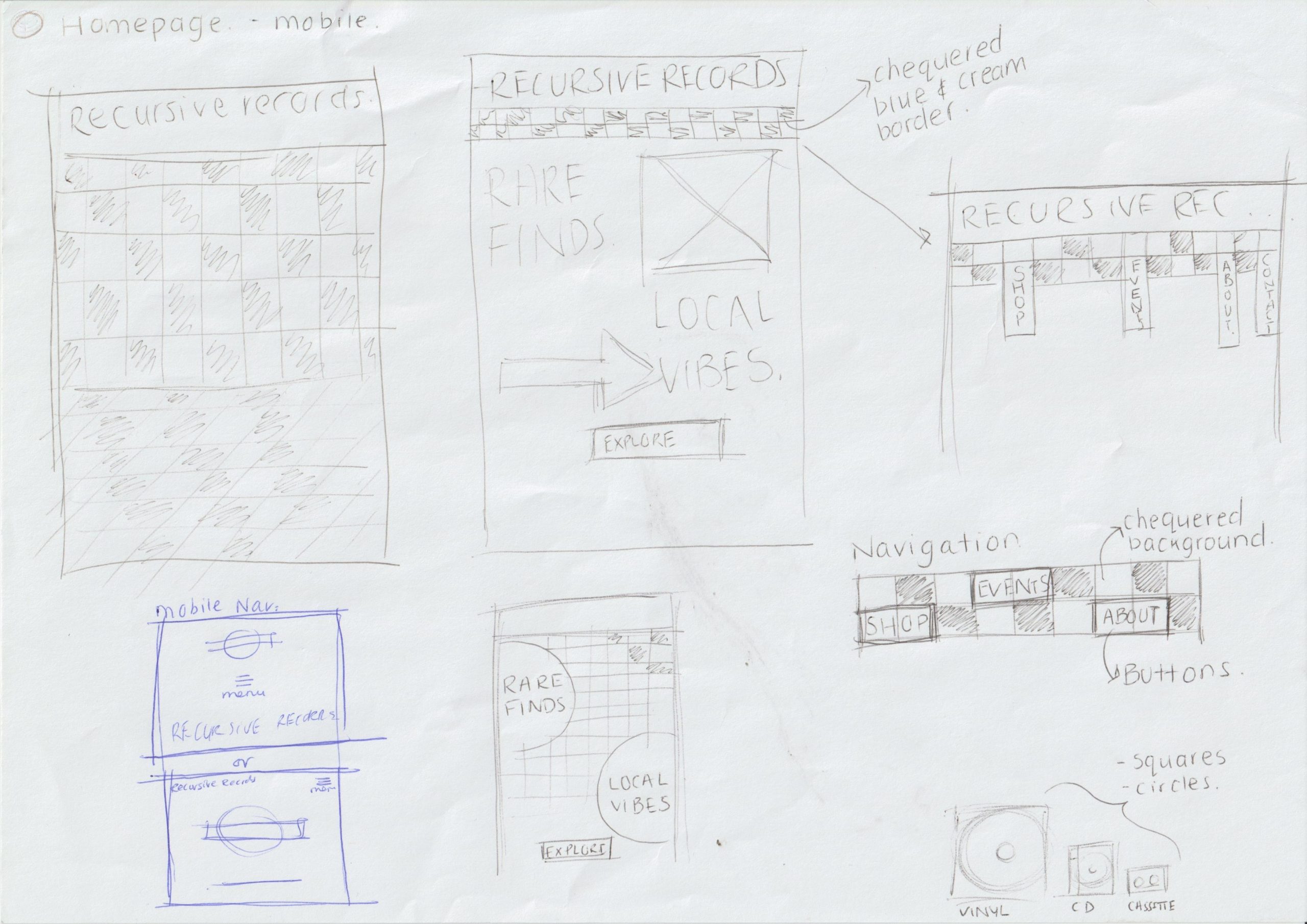
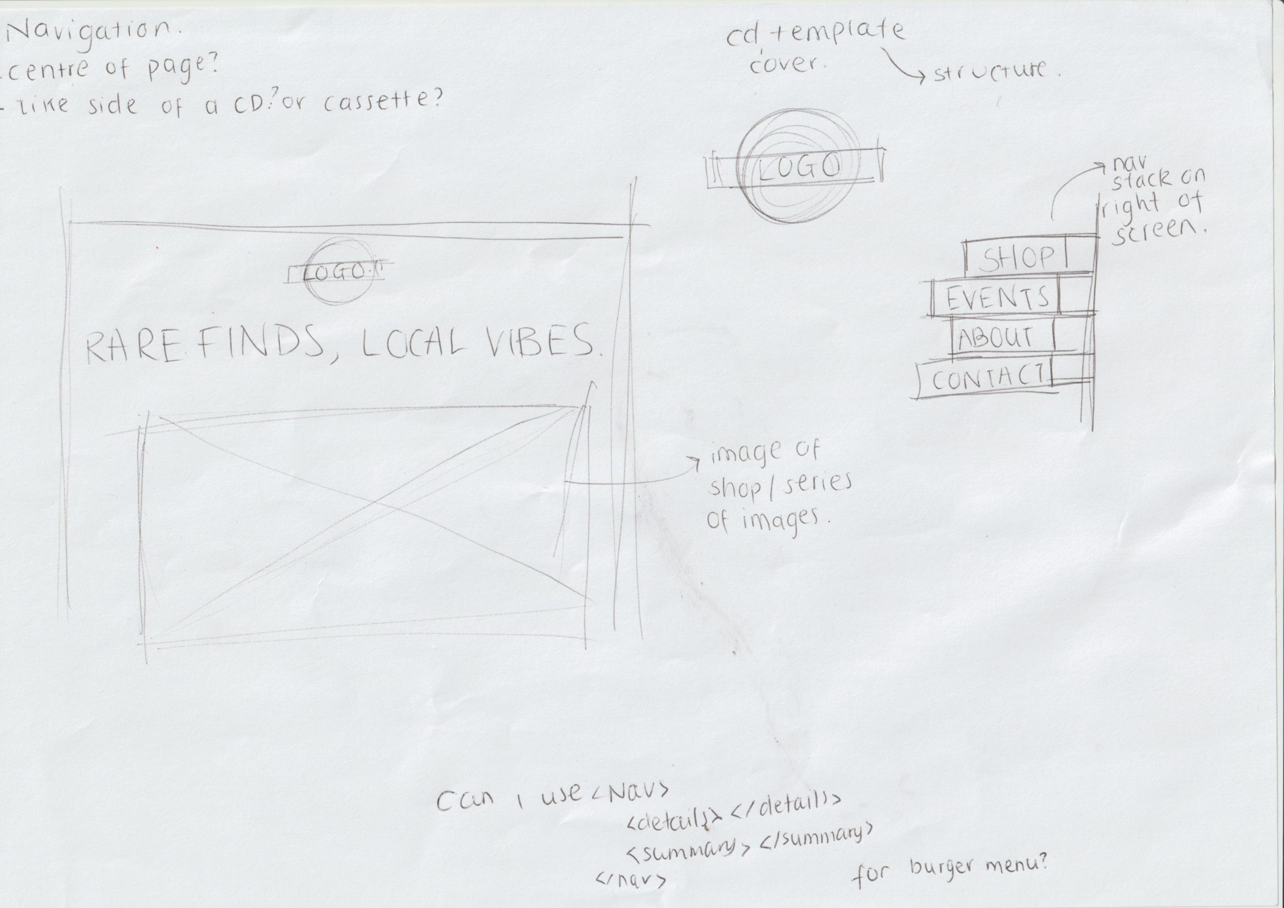
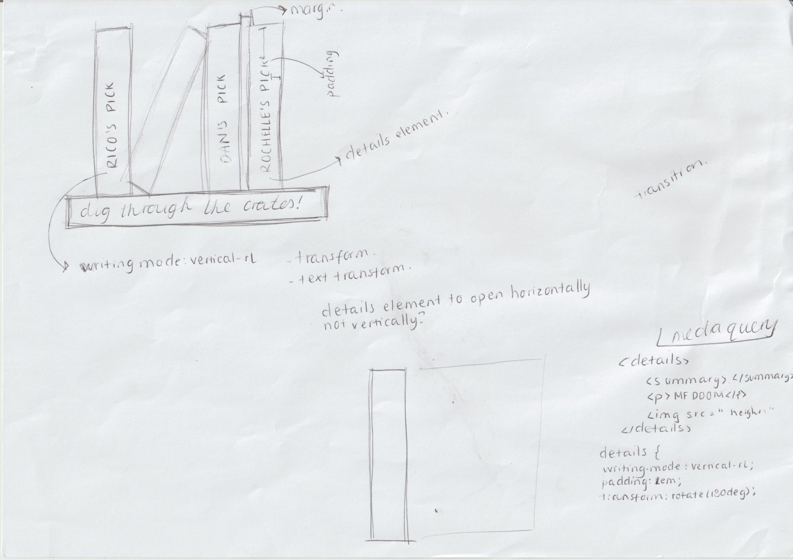
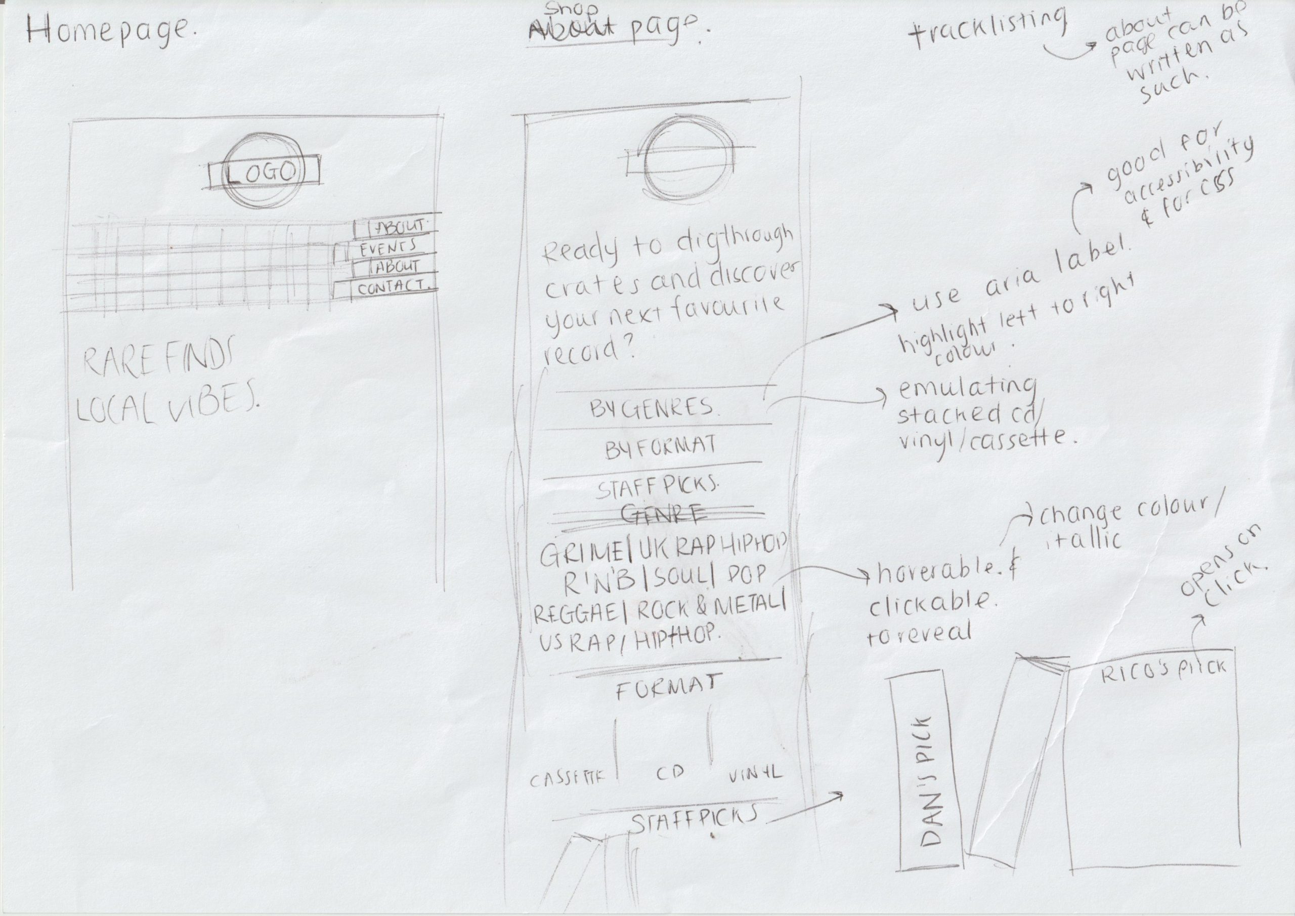
In order to ensure that I wrote my HTML up correctly, I started by sketching out some rough ideas of how I want the website to look visually and paired that with the structure of my HTML. By starting out this way, I was able to pick apart my design ideas and think carefully about their feasibility and how it would in HTML.
Design & Development
Sketching
With good old fashioned pen and paper, I drew up some quick wireframe sketches of my design ideas, drafting out specific elements and pages. This gives me something concrete to work towards whilst writing up my CSS and HTML.
Designing in the Browser
I found this stage of the process most exciting. Designing in the browser allowed me to make and test design decisions in live time. With my sketches / ideas and brand guide at hand I could change my CSS and preview what it does instantly whilst also adapting my HTML so that my ideas work both visually and are structured semantically. This was something that I done consistently thought creating the website.
Brand Design
The overall theme of the brand is very retro and very much a throwback to the 90’s to early 2000’s. The website uses muted colour tones as a nod to the desaturated images from the area to add to the nostalgic feel.
The deep teal colour – a derivative of blue, feels calm and almost sophisticated. With this deep shade, it presents Recursive records quite professionally. In contrast the ‘Mustard’ colour evokes warmth and familiarity and almost feels inviting to the users. The slightly more muted colour over a sharp yellow add to the vintage feel of the brand and website.
Together, the Mustard stands out versus the Deep Teal but maintains consistency with the retro theme of the brand. The Deep Teal acts as foundational colour while the Mustard adds some contrast and warmth. With both colours being quite muted, neither are too overpowering and give off subtle feelings of being inviting and engaging.
Validation & Image optimisation
As a part if my last steps, I run my website through various validations for my HTML and CSS and corrected any errors accordingly. I also run my website through site analytics to determine how well the website performed – improving the site speed with extra image optimisation (using image optim), using the meta description tags in my HTML for better SEO.
Leave a Reply