What is the HTML <details> element? How is it used and how can it be styled and animated?
What is the details element?
The details element can be defined as: a HTML element that specifies additional details that the user can open and close on demand. This is achieved because it creates an interactive widget to hide and display content alongside the <summary> tag.
What is the <summary> tag?
The <summary> tag specifies the content of the details element. It is visible on page load and users can click to expand (or collapse) the details.
How is the details HTML element formed?
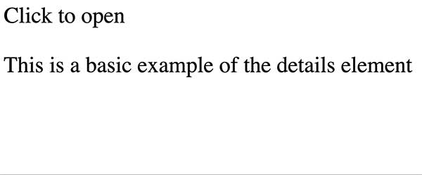
<details>
  <summary>Click to open</summary>
  <p>This is a basic example of the details element</p>
</details>
The details element consists of an opening <details> and closing </details> tag with an opening <summary> and closing </summary> tag nested within.
You can add other elements such as heading, paragraphs, images and more, nested within the details tags, but this content will be hidden on page load by default.
What does it look like?
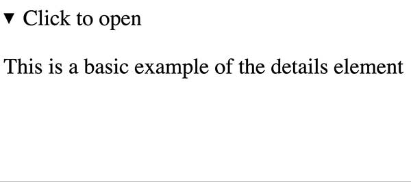
By default, the details element only shows the content of the <summary> on page load.
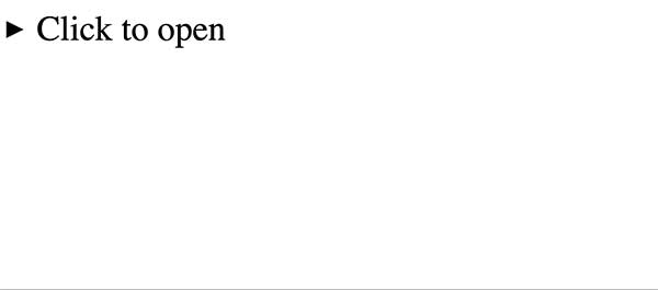
Closed detail element
Opened detail element
Adding CSS
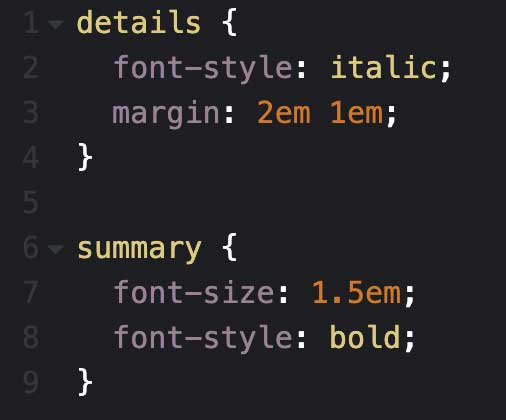
You can use CSS selectors to style as you would with other elements, to change the appearance of the details elements.
You can also use combinators to style other elements within the details element.
The default styling of the details element presents the content of the summary tag with a right facing arrow on close and a downwards facing arrow on open. Some simple CSS rules can be added to remove / change / manipulate the presence of the arrow.
summary {
  list-style: none:
}
You can take it even further
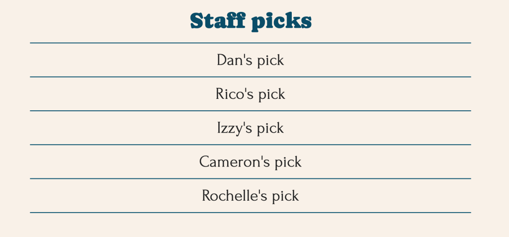
This example shows a series of detail elements, styled to create a list of staff picks.
#staff-picks summary {
	font-size: 1.5em;
	text-align: center;
	width: 100%;

        line-height: 1em;
	border-top: 2px solid #0D5470;
	padding-top: 0.5em;
	padding-bottom: 0.5em;
}
The summary tag in the section with the id ‘staff-picks’ is targeted to center align the text and spread the full width of its container.
The blue line between each details element is created using a border-top property along with padding to create space above and below the text.
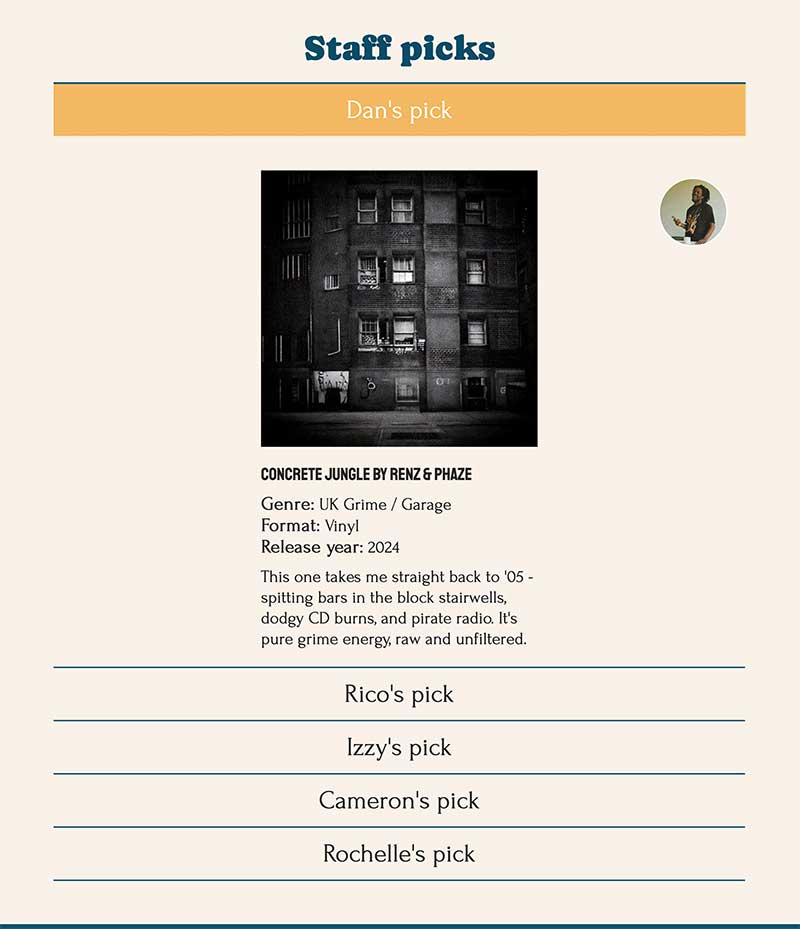
<details>
  <summary></summary>
  <img>
  <img>
  <ul>
    <li></li>
    <li></li>
    <li></li>
  </ul>
</details>
The structure of each of the details element for the Staff Picks.
This shows how you can use nested elements within your details element, and style it appropriately.
#staff-picks p, #staff-picks ul {
	max-width: 400px;
	margin: 1em auto;
}

#staff-picks img {
	display: block;
	max-width: 400px;
	height: auto;
}

#staff-picks summary:hover, #staff-picks summary:active, #staff-picks summary:focus {
	cursor: pointer;
        color: #fff;
	background-color: #f3b962;
	transition: background-color 0.5s ease-in-out; /* makes for a smoother transition between colours */
}
The CSS used, styles the nested paragraph, unordered list and image elements. It also styles the link states, specifically for the summary elements in the section with the id ‘staff picks’.
Adding animation
For smooth opening and closing transitions, you can add some JavaScript as this can not be achieved with just CSS alone.
<details>
  <summary>Click to open</summary>
  <div class="content">
  <p>This is a basic example of the details element. You can also add:</p>
   <ul>
     <li>Images</li>
     <li>Unordered Lists</li>
   </ul>
  <div>
</details>
Adding CSS for animations
We need to add some CSS to ensure the transition works. The CSS styling here addresses the div with the class content when it is open and when it is closed independantly.
When the details element is closed, the content div will have an opacity and max height of 0 – ensurig it is not visisble.
When the details element is open, the opposite is true. The max height is set to 100% to allow it to take up as much space as it needs and the opactity is set to 1 for full visibility.
.content {
  max-height: 0;
  opacity: 0;
  overflow: hidden;
  transition: max-height 0.3s ease-in-out, opacity 0.3s ease-in-out;
}

details[open] .content {
  max-height: 100%;
  opacity: 1;
}
Now for some JavaScript
The script written tells the browser to select all the details elements in the doument and apply the animation one by one. With the use of an event listetner, this is action is depenedant on the toggle (open/closing of the details element). If the toggle is opened or closed, it will use the JavaScript to change the max height and opacity of the content div and apply the CSS transition while doing so.
document.querySelectorAll("details").forEach((detail) => { //select all details elements in the document and loops over each element one by one and applies the animation
        detail.addEventListener("toggle", function () { //listens for the toggle (triggered on open or close) event on each details element
            const content = this.querySelector(".content"); //finds the div with the class content inside the details

            if (this.open) {
                content.style.maxHeight = content.scrollHeight + "px";
                content.style.opacity = "1";
            } else {
                content.style.maxHeight = "0";
                content.style.opacity = "0";
            }
        });
    });
What are the limitations of the <details> element?
Progressive enhancement
We are beginning to see that functions or animations that previously required JavaScript, can be achieved using well structure HTML and CSS.
Leave a Reply