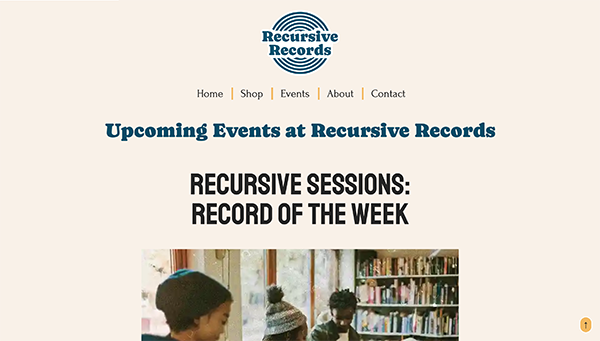
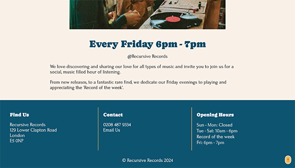
The initial website
From drafting content on Word, to sketching on paper, then designing in the browser, my workflow was driven by the content of the website. My initial submission has a solid structure using HTML and CSS that is valid and well structured. With the content pre planned, I was able to efficiently define logical elements and draft in code with good, semantic markup.
Designed mobile first, the site adapts well to different screen sizes and maintains visual coherence. The design consider good user experience with clean and simple navigation on both mobile & desktop. In addition to this, small enhancements that improve the overall user experience, such as the ‘back to top’ button and the favicon, which further enhances the brand identity across the site.
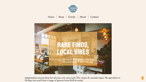
Visually, I focused on building a brand identity that not only suits a small local business, but also ties in well to the nature of the business and their users. The retro late 90’s / early 2000’s style of imagery, emulates the story behind the business and influenced the use of colour – mustard & deep teal. Alongside the bold brand typography and the clean copy, the site visually presents well to users.
The site functions well, is visually compelling and successfully communicates the necessary information to users. While there are many good aspects of the website, there is room for improvement that would further enhance the user experience & make for a better marketing tool for Recursive Records.
While it looks good on first appearance, certain accessibility best practices were overlooked. For example, the code is overall well written, but commenting out the <h1> on the homepage for the sake of visuals, compromised the semantic structure of the site. Whereas, visually hiding the <h1> using CSS would maintain compatibility with screen readers and improve SEO.
The overall attention to accessibility and SEO on the site could be improved. Most link states are set and working well, but a more inclusive design that ties in better with the brand image should be considered to create a more consistent experience for users.
Images are styled appropriately and tie in well with the overall brand image but could benefit for some better optimisation. A few non ‘decorative only’ images lacked alt text which further impacts accessibility and SEO. Alt text could also be written better, using keywords where necessary and be descriptive but concise. Using alternative image formats to reduce image size and maintain good quality as well as using lazy-loading to increase page speed and reduce load times – further improving the accessibility as well as site sustainability.
Revisited version
After completing the first version of the website, I revisited it with a more critical outlook to make meaningful improvements. Building on the strengths of the site, I made the focus of my improvements refining code and its organisation, accessibility, SEO, responsiveness, and overall user experience. As a starting point, I worked through the improvements recommended from my feedback sheet.
Design
The design needed small tweaks. Body text appeared a little cramped and hard to read – particularly on smaller screens. I increased the line-height, which gave the text some breathing room, emulates the overall (well-spaced) layout of the website and enhances the legibility and overall user experience.
The logo in the header is small and misses the opportunity to put its stamp on the page. I increased the logo image size and reduced the margin-top of the header to reintroduce balance and symmetry. It is an important touch as the website is a marketing tool for the business; it instantly allows for brand familiarity and sets the precedent for the brand image.
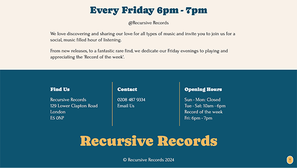
Another issue identified from my feedback was the layout of the footer on wider screens. A quick fix, with some adjustment to the grid, which previously misaligned the footer content with the main content. This, alongside the logo fix, improved the visual balance across all pages.
To the footer, I also added a logotype – a design choice to ensure that the brand image is reinforced. While the logo is already in the header, it moves out of view on scroll, especially on longer pages and smaller devices. From a user perspective, it’s common for visitors to the site to scroll to the bottom to find information such as contact details, store opening times and social media links, for example. Having the logotype here helps to build the visual connection and a good overall cohesive design.
Markup
I read through my code to identify minor mistakes or where a better use of code could be rewritten. I replaced misused HTML, such as the <address> tag in the footer, where it was used to show open hours, with <section>, a more appropriate container. This makes for better written HTML that is correctly using semantic elements and also provides better clarity for users of assistive technologies such as screen readers.
A key change to my homepage was the use of <h1>. In the original version, it was commented out purely for visual purposes, which interrupts the semantic structure of the site and does nothing to aid SEO or site accessibility. I changed the visibility and the content of my heading, which now says
<h1>Independent record shop in East London</h1>. It is now included in the design of the page and remains visible and accessible to all users. It tells the users what the page is about and helps search engines to index the page with good accuracy. To combat the initial reason for excluding it, the design, I simply styled and implemented it as part of the design and flow of the page, not just as your typical large <h1> that is at the forefront of the page as a heading.
The ‘back to top’ button was also improved, in regards to its functionality. I restructured the code to make better use of HTML and made sure that it is keyboard focusable.
In addition to my changes to the HTML, I introduced some PHP to improve the code consistency and maintainability. I separated reusable sections of my code, such as the header, nav and footer and used them as PHP includes.
User Experience
To improve the overall user experience of the website, some additional adjustments were made. To my CSS reset, I added
html {
    scroll-behaviour: sooth;
}
which not only looks better visually on the page when it’s working but is accessibility friendly. It helps improve the experience for all users and particularly for users where sudden or abrupt movement can be disorientating.
On the ‘Shop’ page, I used the details element to allow for toggleable content. To further enhance the experience while accessing the content within the details element, I use the name attribute to group together accordion sections. Advancements to the details element (WHATWG) allow the details to act as an accordion without the use of JavaScript. Though the use of the name element invalidates the HTML according to the W3C markup validator, it is a progressive enhancement and not accessible on all browsers, but does not interfere with the functionality on non-compatible browsers. The use of the accordion helps to maintain a clean and decluttered layout.
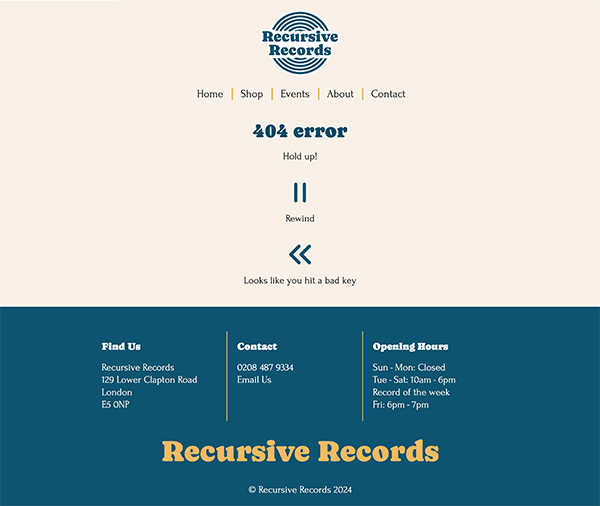
A custom 404 page, again, reinforces the brand image and creates consistency across all possible pages. It adds to the site’s professionalism and appears to users to be a solution-based, familiar interface where they can find their way back to what they were exploring on the site.
Accessibility
Accessibility was a key focus for my revisited website as I wanted to make sure that all users can benefit from a good, seamless experience. I ensured that all interactive elements, such as links, are fully navigable by keyboard-only users – important for users who rely on using the tab key to navigate through site content. For this to work well, I also made some adjustments to the visual output of my focus states. I changed my use of :focus to :focus-visible to ensure for modern browsers, the visual feedback is only visible on use of the tab key and not mouse click. Using the outline and outline-offset properties, I customised the appearance of a focused element, again in line with the overall brand design.
:focus-visible {
    outline: 3px solid #f3b962;
    outline-offset: 4px;
}
I added a skip to content link
<a href="#main" class="skip-link">Skip to main content</a>in the header.php, which becomes visible when focused, using the tab key to navigate. It allows users to bypass the main navigation and jump straight into the page’s content. From an accessibility perspective, it aligns with WCAG 2.2.4.1 and significantly improves the user experience for screen readers and keyboard users.
Sustainability and performance
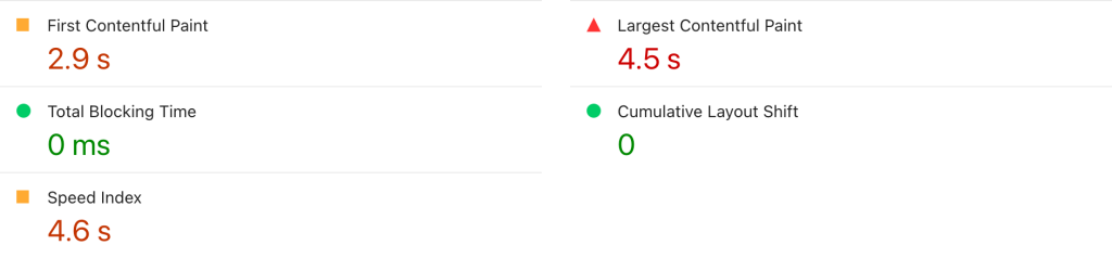
The overall sustainability of the initial version of the website was fair but had room for improvement. Lighthouse performance audit showed a largest contentful paint of 4.5s and a page speed index of 4.6s, both of which result in delays in load times. Not only does it impact user experience, but it also affects the efficiency and sustainability of the site. To improve performance and sustainability, I made several changes:
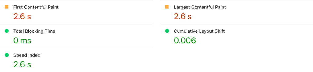
I converted images to WebP format, where appropriate as it offers better compression compared to jpeg and png. I trailed and tested outputs to find a balance between image quality and compression. Additionally, I ensured all images were properly sized and compressed using tools such as imageOptim and compressor.io, thus balancing optimisation and performance. In effort to again, reduce the page load time I implemented loading=“lazy” on all images that do not need to be loaded upfront, ie. images not above the fold. This means images are only loaded as they come into view on the screen, reducing the initial page weight and load time.
SEO and Meta Data
Another key part of my revisited improvements was the SEO strategy. The original version lacked descriptive markup and could really benefit from a more focused and structured strategy for better performance in search engine results and on social media platforms. The updated versions address this in several ways, such as using more descriptive titles and alt text, an improved heading structure and use of meta data.
Each page now uses a specific and descriptive <title> tag that is relevant to its content. For example, the homepage was changed from
<title>Home - Recursive Records</title> to
<title>Rare records in London - Recursive Records</title> This does not only improve the use of relevant keywords but also ensures that users see meaningful titles on search engine results. The same applies for the use of the <description> tag – again looking at the homepage for example, was changed from
<meta name="description" content="A homepage for the Recursive Records shop">to
<meta name="description" content="Browse rare, secondhand and collectable vinyl at Recursive Records in East London. Discover new music & join live events.">.A final adjustment made to specifically address the function of the website as a marketing tool was to add some Open Graph Meta Data. The website will be easily shared across social media platforms, so the Open Graph Meta Data allows for the shared links to be well presented. Again, this reinforces the brand image and is a nice touch for Recursive Records to have, particularly when considering the purpose of the website.
Conclusion
Overall, the adjustments made to the original site all add to the functionality, accessibility and potential for success from a buisness perspective. They address key issues that would otherwise impact user experience and make for a much stronger site.