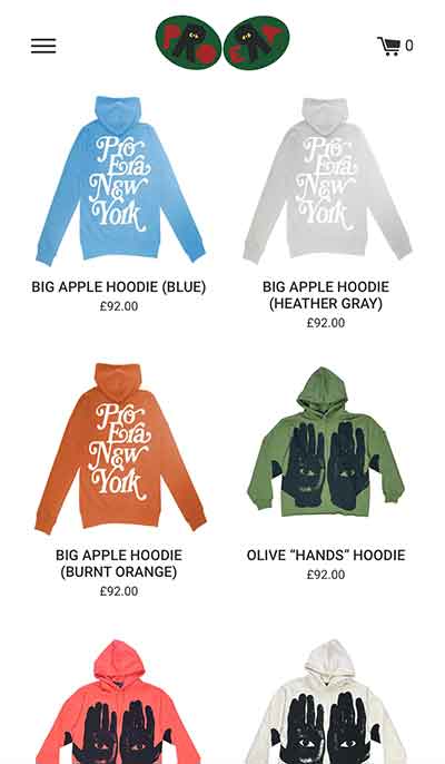
theproera.com
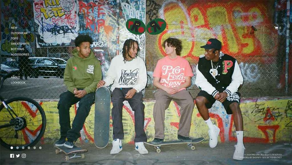
With music, videos and photography being an important part of the pro era brand, the essence is well reflected through the heavy use of visuals throughout the website. The full width image background on the landing page, subtly changes and engages the user.
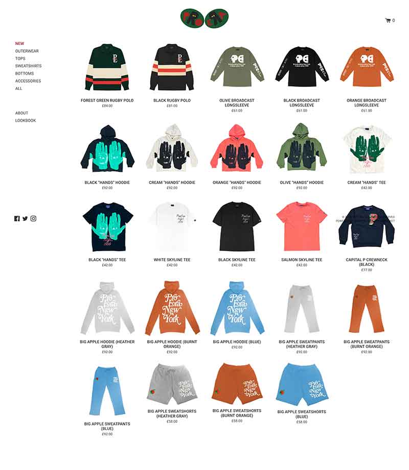
The e-commerce sections of the website are seamlessly integrated to their brand / visual identity with a consistent aesthetic – making it easy to shop around.
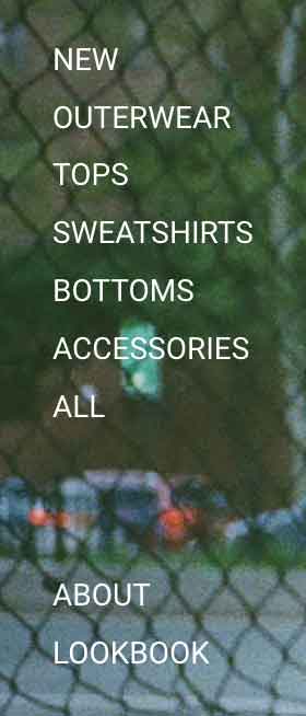
Contrary to the bold background images, the navigation bar is kept simplistic and allows users to effortlessly explore the website. It is well positioned and does not interfere with the images on the background and vice versa. It is also well structured with the different types of pages grouped together, allowing easy exploration the website without having to click 2 or 3 buttons just to get to the ‘outwear’ page for example. The website uses interactive features, but again they have been kept to a minimum and aid the clarity of the navigation menu – the text background change on the hover not only makes the text stand out more but also lets the user know what they are selecting.
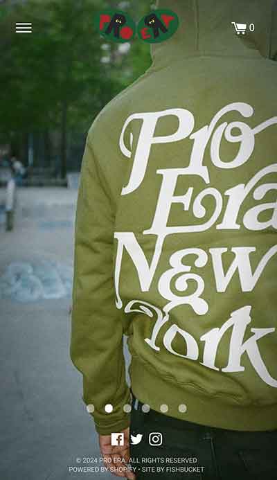
The website maintains its visual clarity and usability across different devices – you do not get a compromised experience exploring the website on different platforms.
gov.uk
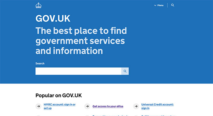
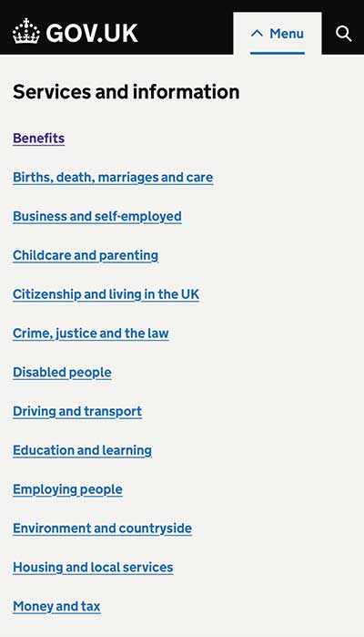
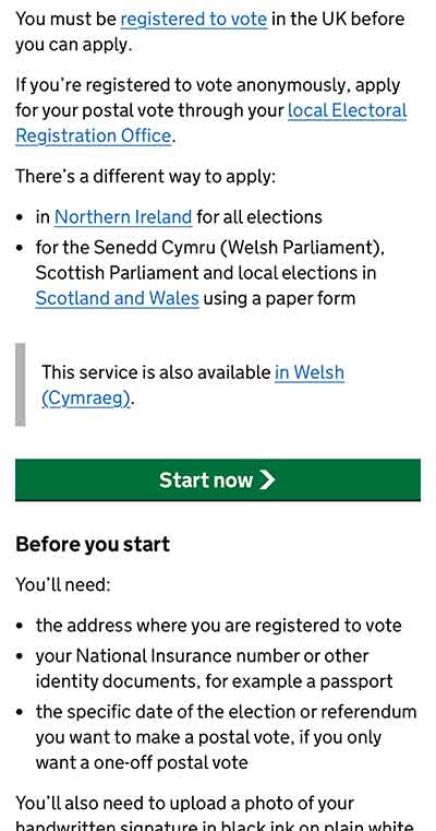
The gov.uk website is an information heavy website which is thankfully easy to navigate. This is a great example of good design as it does not overcomplicate anything, there is nothing on the website that doesn’t provide information. The typography is simple and consistent across the website and the sans-serif font is easy for the user to read and take in information quickly and efficiently.
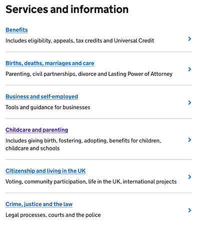
As well as the typography, the structure of the content is also well designed. The homepage contains links to various pages each with a subheading describing what you may find on the corresponding page. As well as this, some quick link names that have a call to action such as ‘Get access to your eVisa’ – it directly points out what you may be trying to do.
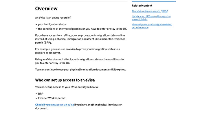
Linked pages have a clear visual hierarchy that helps users to navigate through the page. Clear headings, bullet points and links make the information on the page quick to follow and digest.
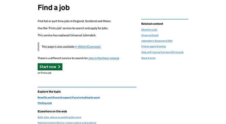
Application buttons are green. Links are blue. Informative text is black. The use cohesive use of colour adds to the user experience by making content easy to consume without having to think about it. After moving through just a few, users become familiar with where they can find the next link or what is information.
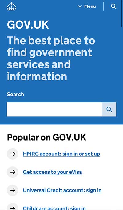
The website is also works well on other platforms and you get the same experience from using other devices such as mobile vs a computer. Links work just as well on mobile as they do on the desktop website, and you get the same experience with buttons, hierarchy, and colour.
NatWest
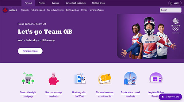
The NatWest website is very well designed with the user in mind. Though it has multiple navigation bars, it is easy for customers to identify what services they need from the clarity of the design. This is aided by the strong use of a consistent colour palette using NatWest brand colours. The use of icons adds to the visual quality of the website but also allows for quick interactions and enhances the accessibility of the website, as they can make it easier for users with disabilities or speakers of other languages to use the website.
There is a good use of white space on the page. With the bold purple colour this helps to provide clarity and differentiates where there is important information that may need to be digested vs the more informal sections of the page. Colour is also used with selected typography to differentiate headings from links, from additional information.

Small details such as the lock icon for the login button add to the experience. Being a banking website, security is important, and this emphasises their security efforts. The website uses interactive features such as the chat box to enhance the customer experience and highlights the importance of customer support alongside the other help options such as the FAQ’s and contact sections.
Leave a Reply