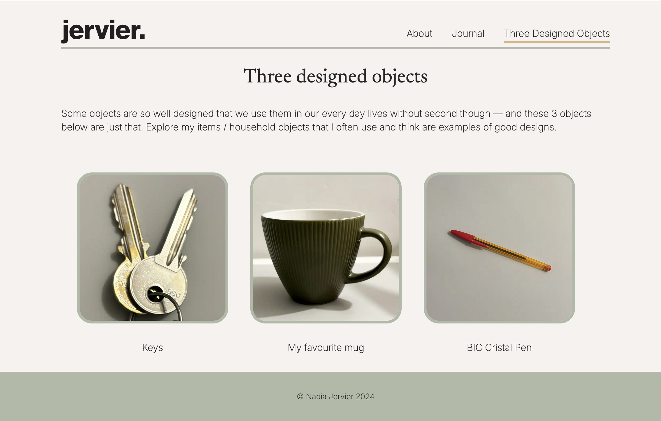
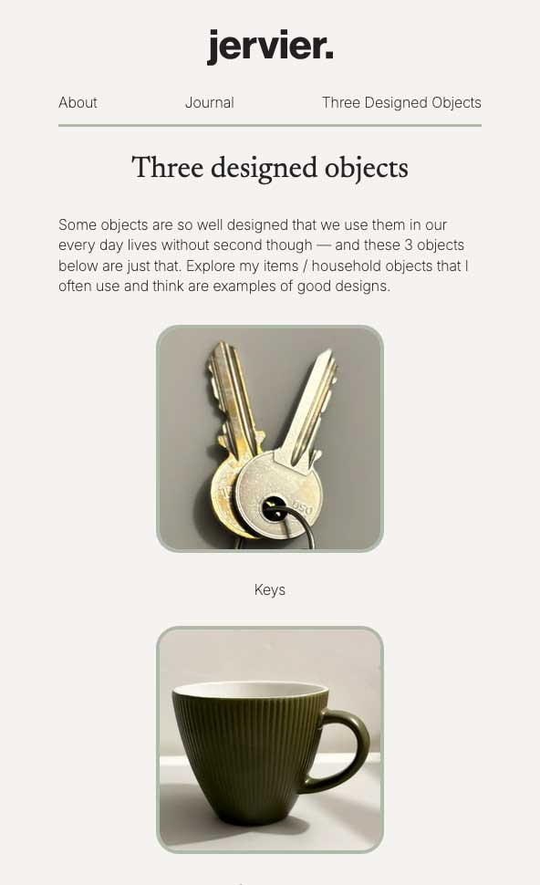
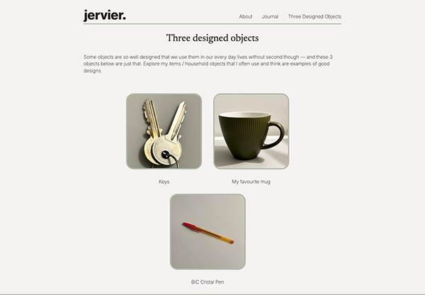
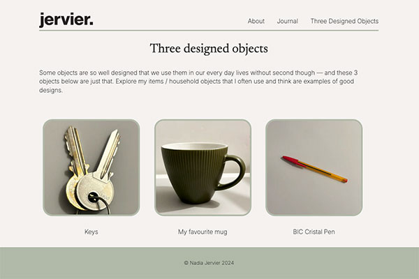
Three designed objects
Development // Design
Sept ‐ Nov '24
Overview
The project that started it all...
A four page static website, built only with HTML and CSS as an initial introduction to web development. Exploring structure, styling and understanding the basics of writing clean and semantic code.
Tech stack: html css
An introductory project to web development, focusing on the fundamentals of HTML & CSS. The overall goal was to create a simple website that is accessible with content that is well and semantically structured.
The project was an opportunity to:
- ‣ Learn and apply semantic HTML
- ‣ Experiment with CSS styling
- ‣ Understand linking pages and basic navigation
From a blog post exploring good design in our every day lives, the website was produced using the 'content out' method — developed and evolved as I learned more about HTML & CSS.
Minimalist design, focused on creating a clean and well structured layout, ensuring accessibility and readability.
HTML structure & semantics
<header>
    <a href="../../index.html">
        <img src="../../images/jervier-logo.svg" alt="Nadia Jervier logo" width="138" height="50">
    </a>
    <nav>
        <ul>
            <li><a href="../../about/index.html">About</a></li>
            <li><a href="https://nadiajervier.co.uk/journal/">Journal</a></li>
            <li><a href="index.html">Three Designed Objects</a></li>
        </ul>
    </nav>
</header>
<img src="images/mug-good-design-example.webp" alt="A dark green tapered shape ceramic mug with vertical ridges" width="300" height="300">
CSS & layout
- ‣ Flexbox for navigation layout
- ‣ Typography hierarchy
- ‣ CSS Reset for consistency across browsers
Navigation
- Accessible navigation menu
@media (min-width: 960px) {
    main img {
		width: 400px;
		height: auto;
	}
}
@media (min-width: 1400px) {
	main ul img {
		width: 250px;
		height: auto;
	}
}
From completing the project for the three designed objects website, I was able to gain a strong understanding of structuring html and best practises — including understanding navigation and applying UX considerations to design. I also developed skills in CSS and applying principles for creating responsive design.